AGREED ONLINE ESCROW
PROBLEM: Online escrow service websites are inherently complex, but also ugly and barely usable
SOLUTION: Disrupt the space with a beautiful and usable desktop and mobile experience that simplified the complexity
WHAT I DID: Discovery + application design + information architecture + usability testing + content strategy
IN COLLABORATION WITH: Primitive Spark
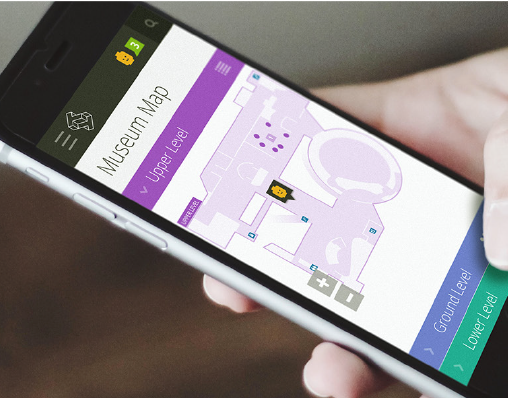
DISRUPT A COMPLEX SPACE. Agreed's parent company approached my team to help them design a space-disrupting online escrow application focused on domain name trading. Several "big player" tools were already on the market, but they had woefully bad UX and design. Our challenge: Design a desktop and mobile-friendly, self-service app that would be easy for newbies but powerful enough to handle the wildly complex, multi-step, legal and financial process that is domain name trading.
PRODUCT DESIGN FROM THE GROUND UP. I designed the crazy-complex application UX for Agreed from the ground up. My team and I also provided user research and testing, brand naming and name testing, plus design and content for the new corporate website to introduce the app to the world. I led the Content Strategy effort, establishing the tone and voice for the brand, and delivering fresh content for the bulk of the website and application launch copy.
$872MM
PRICE OF THE MOST EXPENSIVE DOMAIN NAME ON RECORD:
CARS.COM, SOLD IN 2014.
DEEP DIVE INTO DOMAINING. Much UX fun can be had with a deep dive into an unfamiliar topic. For Agreed, I immersed myself in the world of domain name escrow and learned more than I ever dreamed I'd know about the specialized domain sale and escrow process. Like real estate, domain name flipping can be a high-stakes business, with domains sometimes selling for millions of dollars.
My team and I conducted a series of stakeholder and end-user interviews with domain sales pros who live and breathe "domaining." We also talked with entrepreneurs
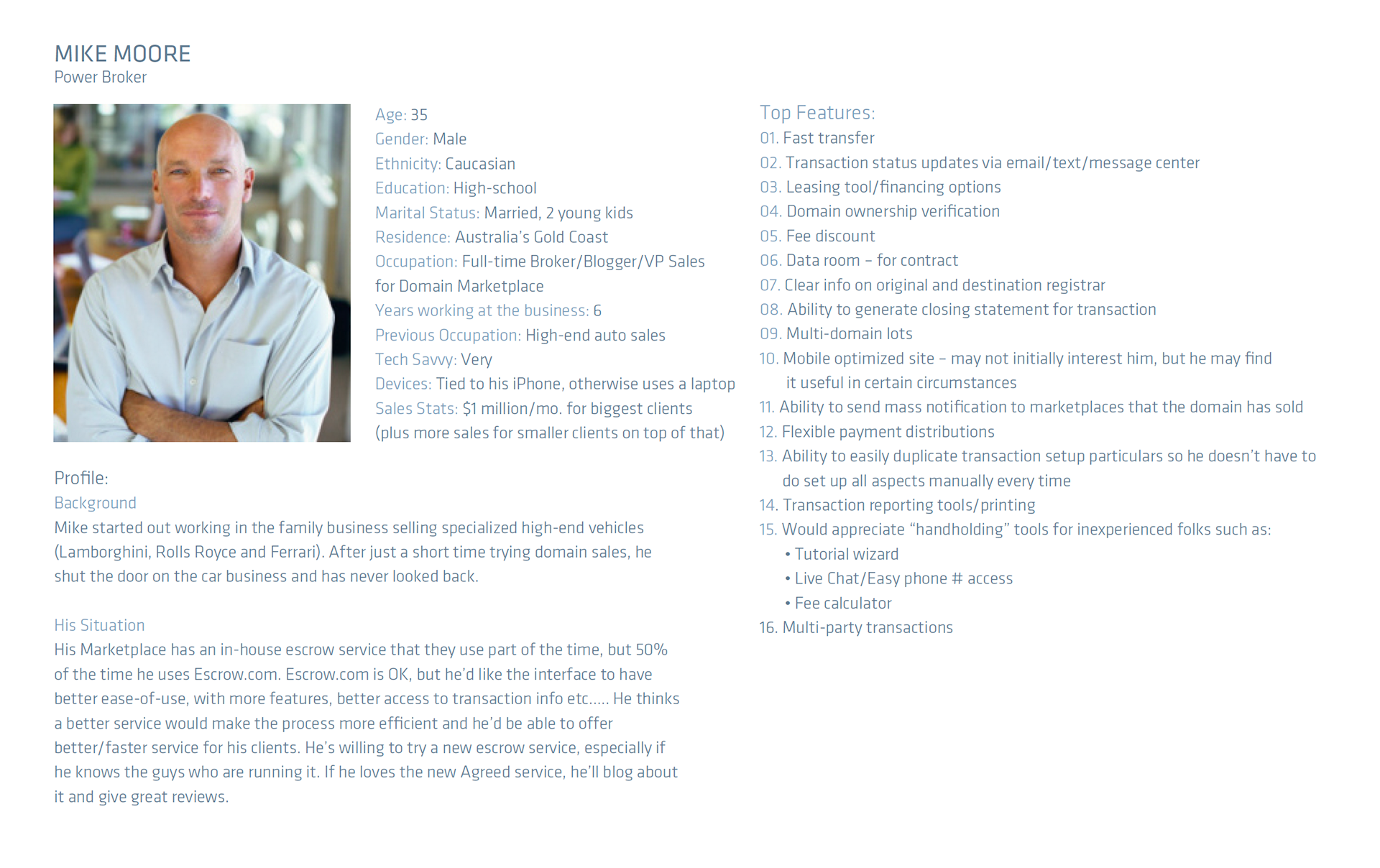
seeking to obtain or sell a high-value domain name for a business as a one-time thing. I used the information gathered in the interviews to draft a set of domainer personas.
MEET THE DOMAINERS
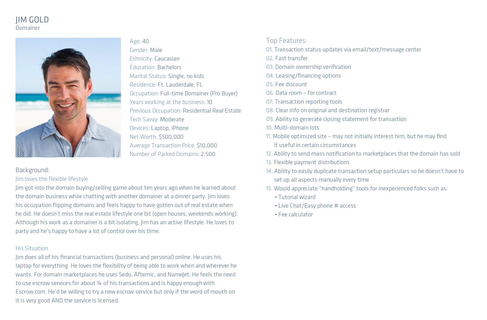
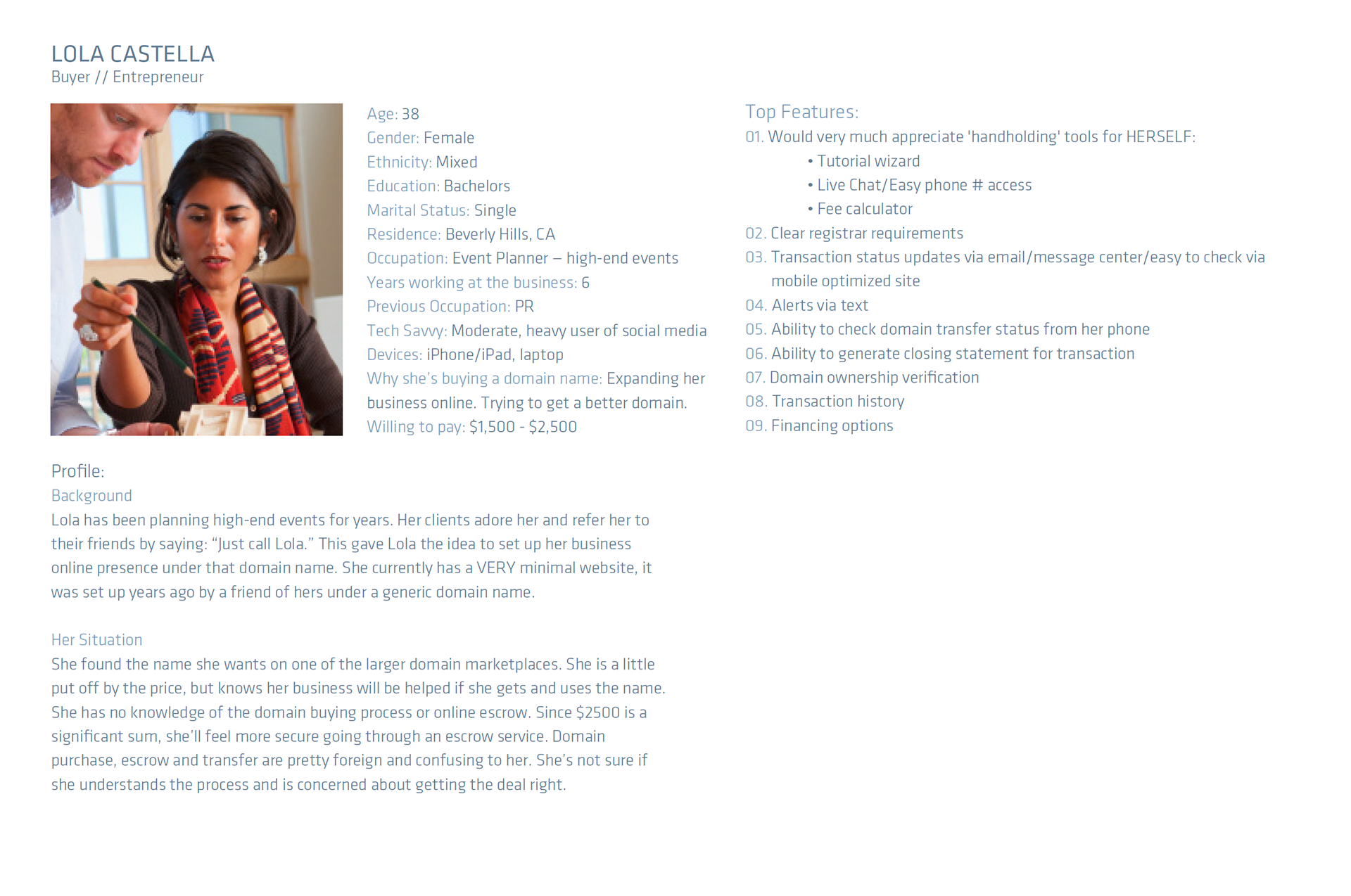
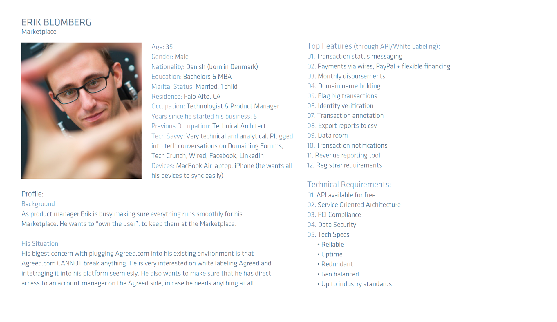
UNTANGLING A LABYRINTH IS A TEAM SPORT. Creating intuitive UX for this brand-spankin' new and complex application turned out to be a very collaborative, iterative process. I led the information architecture effort and started untangling the application with multiple deep-dive whiteboard sessions with the client team. Our challenge was to determine the right blend of usability, product functionality, and flow to create a product that would obliterate the competition.
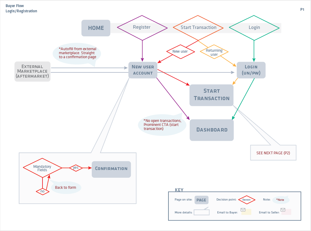
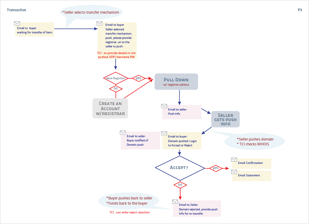
Once we understood the basic product structure, I created an application map organizing the major features, and a series of flows to capture the multiple user interactions and steps from beginning to end of the domain name escrow transaction process.
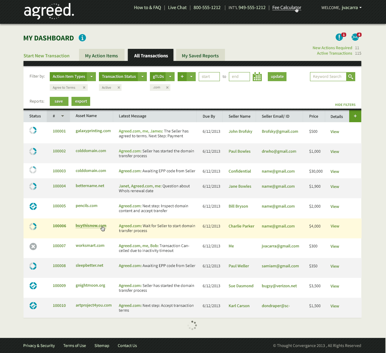
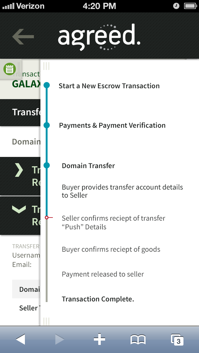
MAKES MORE SENSE WHEN IT'S CLICKABLE. I developed an Axure clickable prototype to help communicate and test several complex portions of the application as we iterated on the UX. The product included a multilayered sign-up process with extreme transactional complexity. We experimented until we found clear cues to guide users through each step of a transaction with its many decision points and possible snafus. From there, we created a visual UI and responsive design that was truly a beautiful thing to behold considering the product required so many screens with jam-packed tables of data.
UP, UP AND... AWAY. Agreed released its new platform into the wild in January, 2017. The launch was a huge success. The product UX and UI were far easier, better looking, and more efficient than anything else on the market. Their biggest competitor, Escrow.com, took one look at that and snuffed out its competition by purchasing Agreed.com a mere nine months after launch.
PROCESS DOCS
USER FLOWS
MOBILE

UI design by Primitive Spark
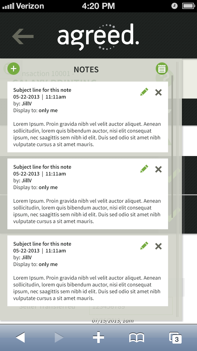
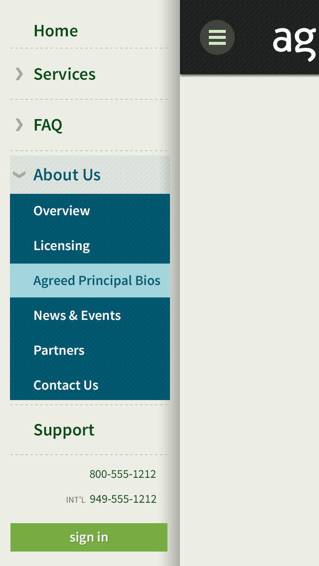
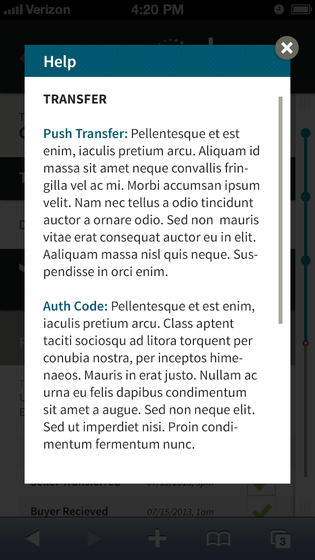


UI design by Primitive Sp
IA > DESIGN
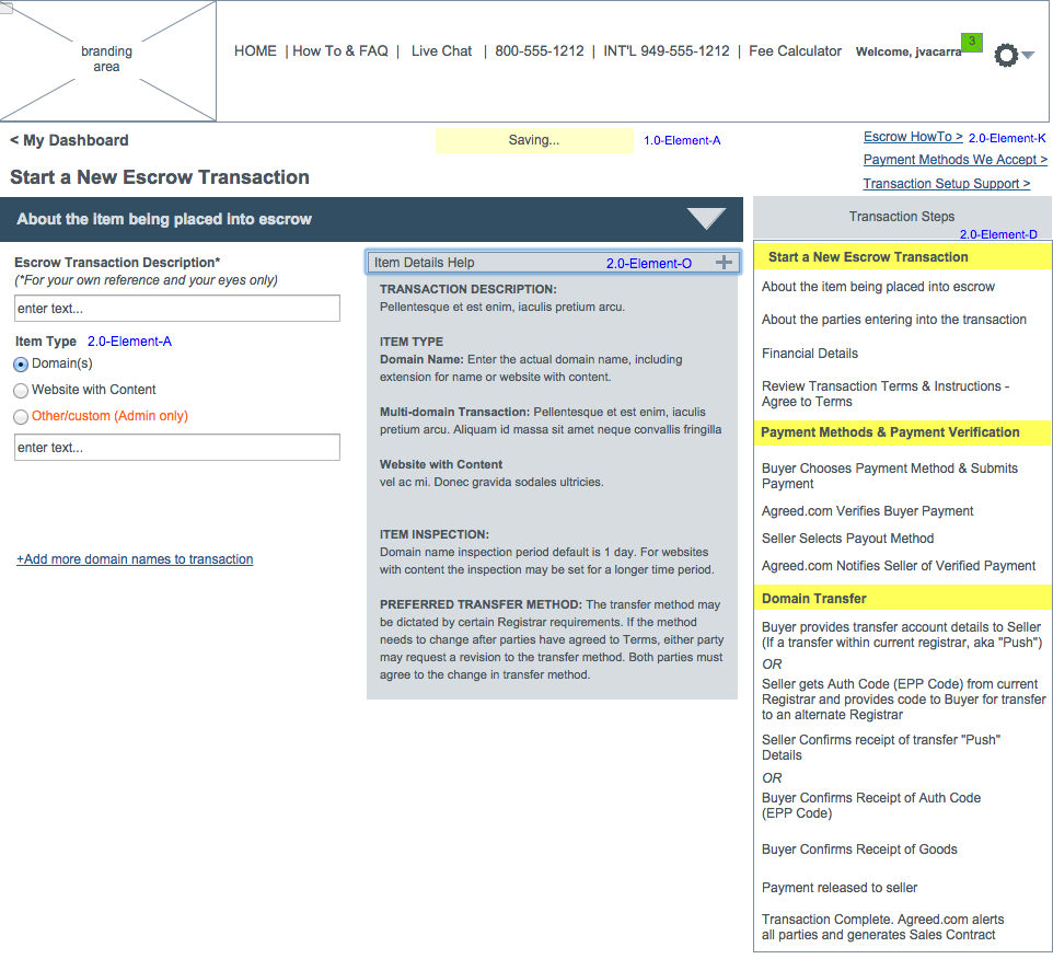
IA

IA
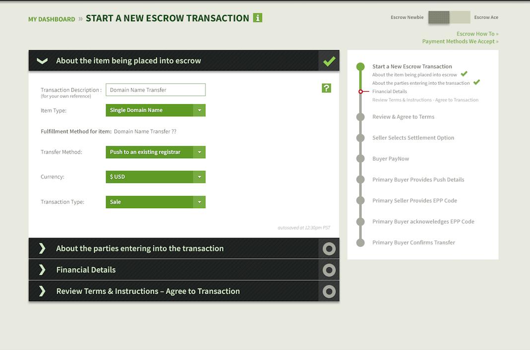
UI Design by Primitive Spark
