UCLA CENTENNIAL CAMPAIGN
PROBLEM: Design studio Fundi's UCLA client had never done a website before. No experienced digital design team in place. Compact timeline. No digital strategy, information architecture, content strategy, or savvy digital visual design.
SOLUTION: I quickly gathered a nimble team of experts to work under the Fundi umbrella, including a CMS developer, a visual designer, and me, offering IA, content strategy, digital strategy, and plenty of client tutoring and digital project management along the way.
WHAT I DID: Digital and content strategy + desktop and mobile information architecture + project process setup & management for discovery, IA, & design phases.
IN COLLABORATION WITH: Fundi Design + Joey Kantor Design + Josh Kunin/Interactivism.
SUDDEN SCOPE EXPANSION. Boutique design agency Fundi first approached me as they were embarking on a project that had been scoped as a relatively simple venture. The project was rapidly morphing into an involved enterprise with expanded requirements: information architecture, a more sophisticated visual design, and a new development team that would need to be far nimbler than the one that was originally slated to do the CMS.
PROJECT PLAN OVERHAUL. I started by helping Fundi and the UCLA client team put together a viable project team, process, and timeline that would include some basic user research, content strategy, and an efficient but robust IA phase. I referred Fundi to top-notch resources, including a CMS developer and a talented visual designer, both of whom I'd worked with previously.
COACHING GRASS-GREEN WEB NEWBIES.
The client team had never worked on a website project before. I met to brief them on what to expect with upcoming project phases and gave them some coaching on what would be required from them during the process. Client team members were quick studies, plus there were a couple of strong writers on their team, so we knew content shouldn't be a launch blocker.
1919
UCLA WAS FOUNDED IN 1919 AS A TEACHING COLLEGE.
SCHOOL IN SESSION. To make the most of UCLA's slim budget, I went into "professor mode" and coached the UCLA team on how to identify their audience types. They didn't have a budget for foundational audience discovery, so I provided them with a worksheet (the same one I give to my Intro to UX students) so they could create basic DIY personas on their own.
PHASE THE IA. One project challenge was the need for a phased launch. A very streamlined launch part 1 would happen in January, followed by launch part 2 in March, with the final full version of the site launching the following June. To assist this process, I created a sitemap and wireframes in Figma that illustrated the launch progression across all three phases. I also provided content strategy coaching to help the clients plan, create, and phase in the site content once their new CMS was ready.
PROCESS DOCS
SITEMAP
DESKTOP WIREFRAMES
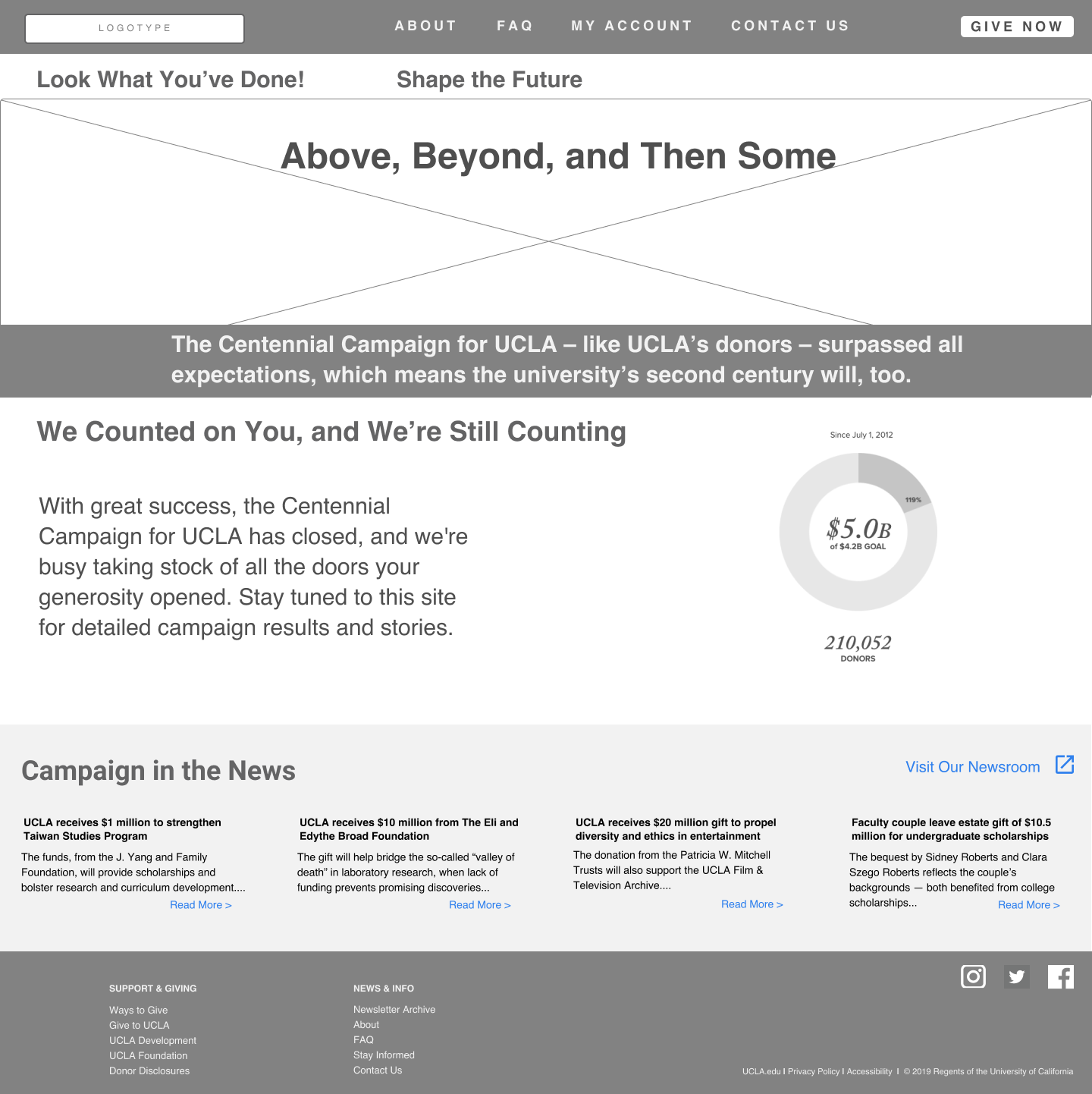
Home - Launch 1
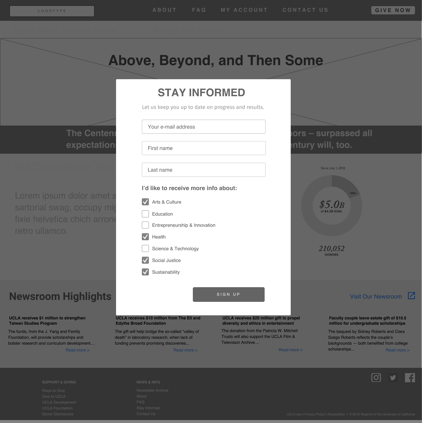
Home - Launch 1 modal
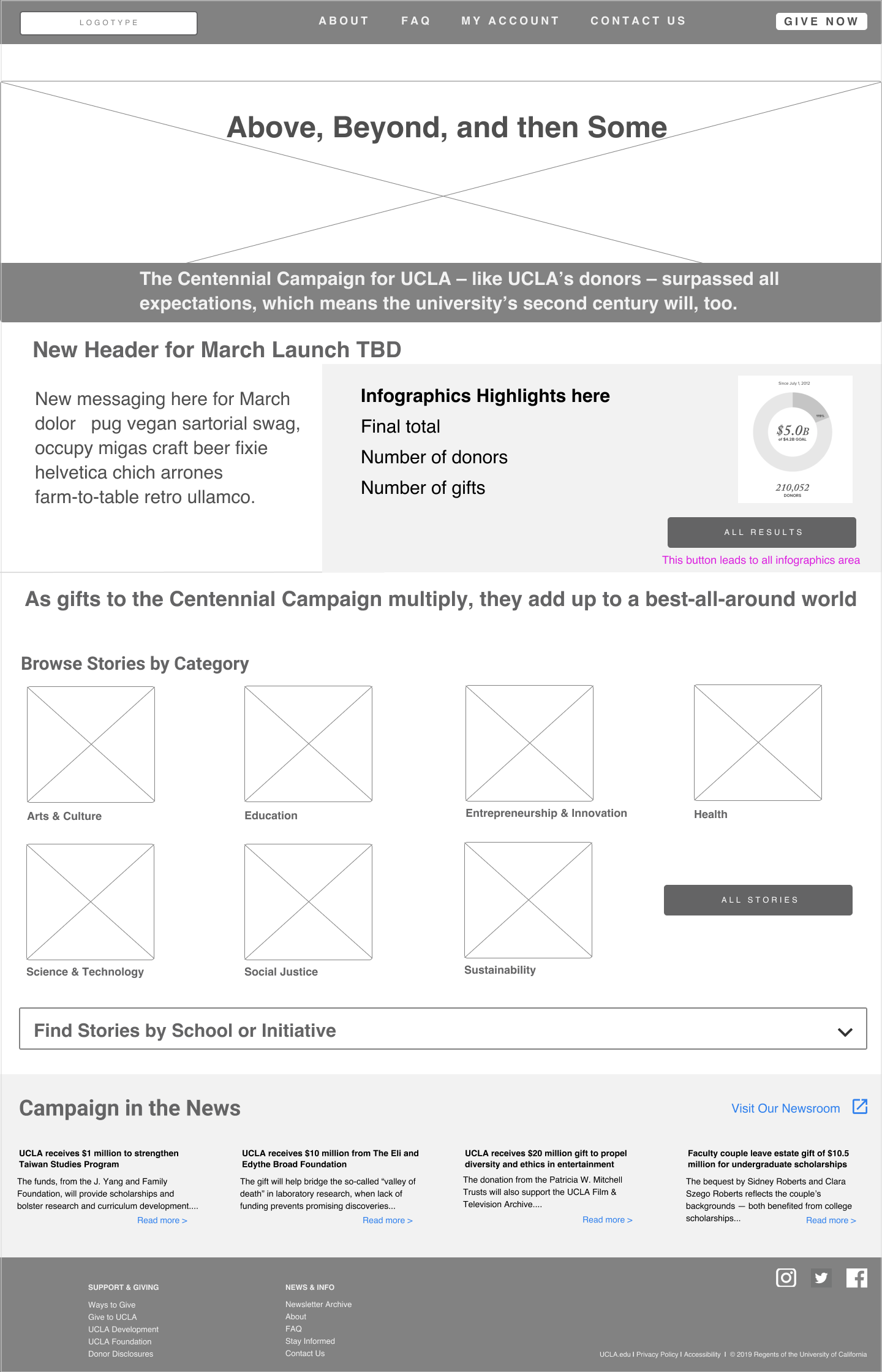
Home - Phase 2
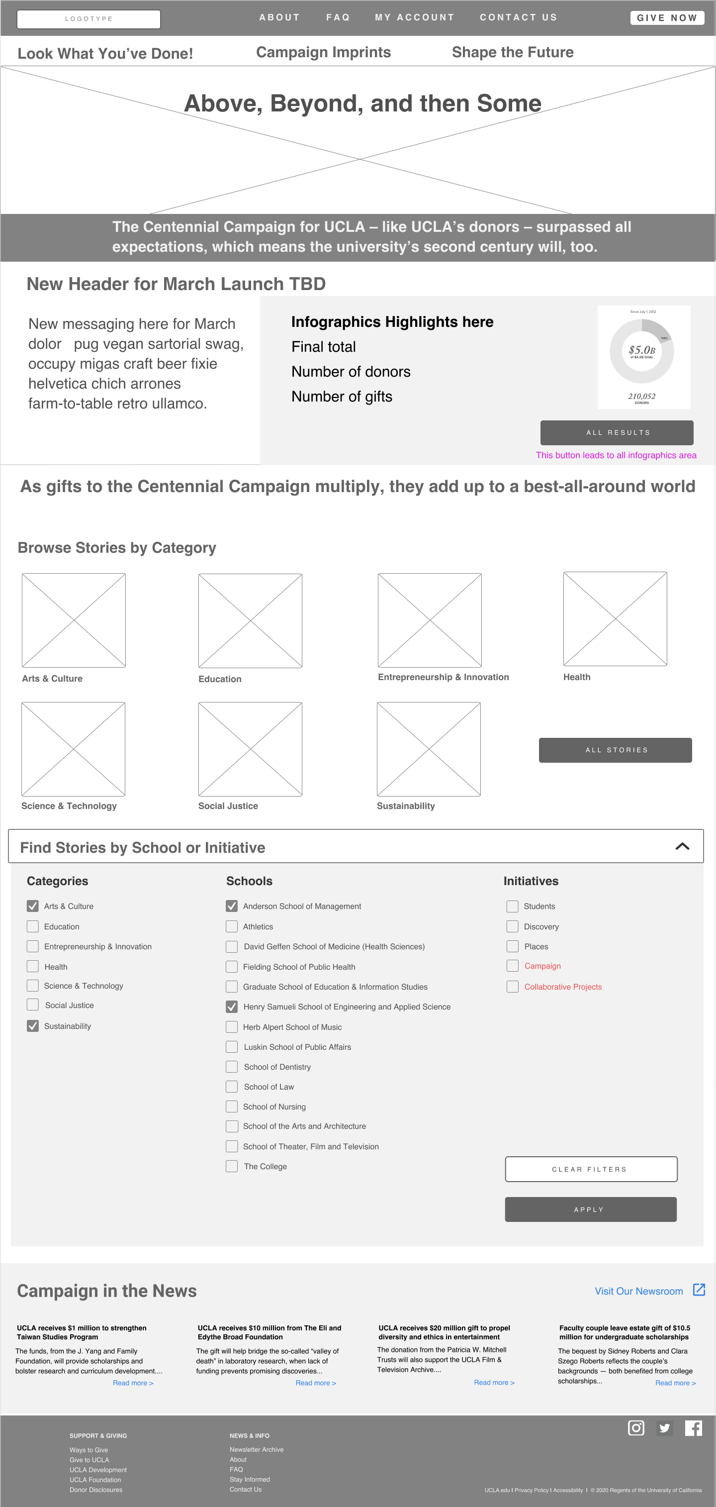
Home - Phase 2 filters
MOBILE WIREFRAMES

Home - mobile

Home - mobile nav

Stories

Stories - apply filters
VISUAL DESIGN
Design by Joey Kantor & Fundi Design
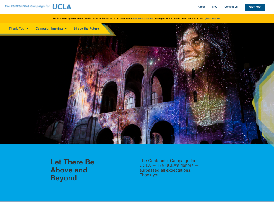
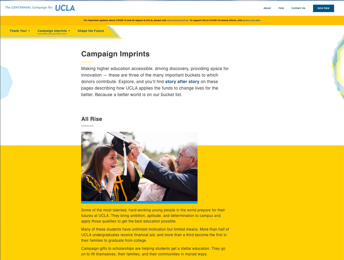
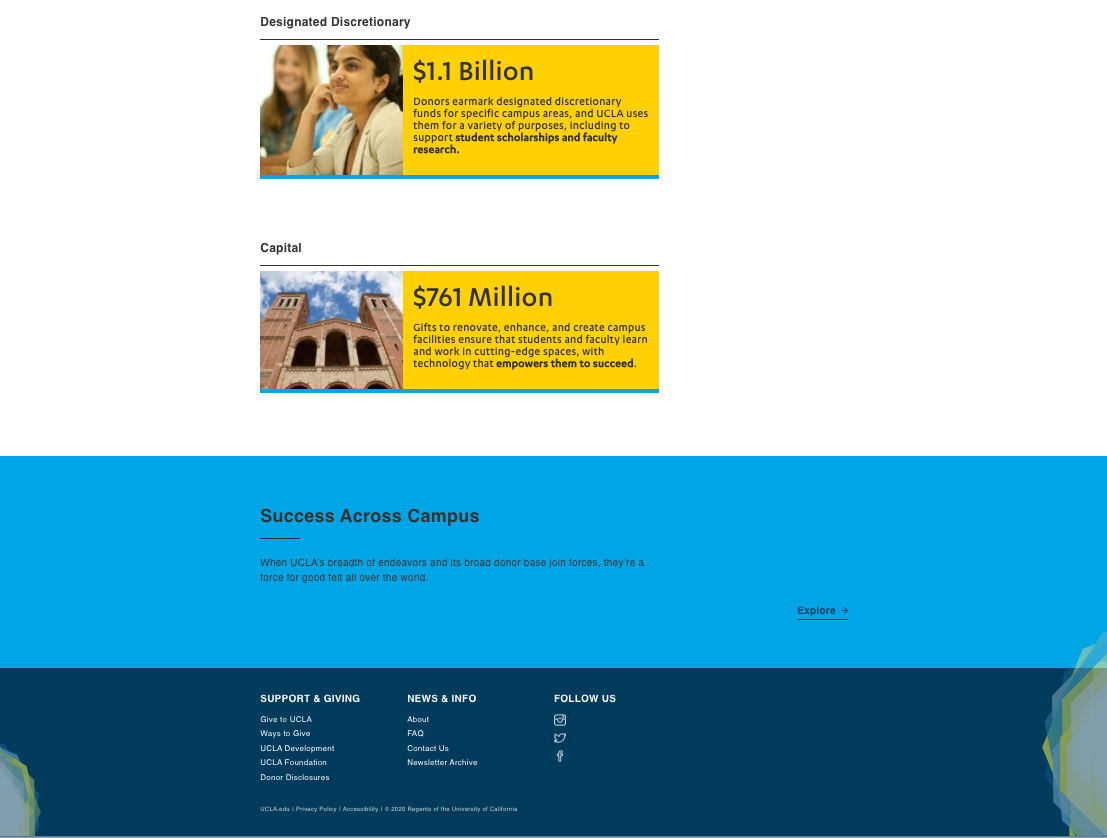
RESULT
"...A sophisticated, results-driven website, powered by
strong imagery, infographics and clear navigation. The real
beauty of our collaboration was realized by the powerful
content management system that allows us to adapt and
grow the site over the coming months and years."
- SUSAN LEWIS, ASSOCIATE DIRECTOR OF MARKETING, UCLA DEVELOPMENT
