Visitors at The Tech - photo by Primitive Spark
SMART MUSEUM
PROBLEM: Design an intelligent museum experience visitors love
SOLUTION: An integrated, responsive website to digitally enhance the visitor experience in the museum and at home
WHAT I DID: Research + information architecture + usability testing
IN COLLABORATION WITH: Primitive Spark
REINVENT THE MUSEUM EXPERIENCE? NO PROBLEM. Visitors of all ages flock to the Tech Museum of Innovation in Silicon Valley to engage with cutting-edge science. When the hands-on learning center wanted to reinvent their museum experience, my team and I at Primitive Spark created an imaginative, interactive Smart Museum, a uniquely social museum experience both inside and outside the facility.
50,000
APPROXIMATE NUMBER OF YEARLY TECH MUSEUM VISITORS
INTEGRATE IT ALL. The new site needed to integrate the museum’s desktop website, mobile website, gallery kiosks, and electronically-aware exhibits. Many of The Tech’s exhibits have interactive components that monitor experiments, and take visitor photos and videos. Our new interface would give users access to these digital artifacts, plus related content and social features.
- Adhere to ADA wheelchair accessibility standards.
- Support an audio interface for the sight impaired.
- Support multiple languages.
- Comply with COPPA (Children’s Online Privacy Protection Act).
- Deliver shared, social engagement.
- Offer visitors divergent yet cohesive functionality at the museum vs. off-site.
Photo by Wendy Nyx
HOW WE DID IT. Once on board, our team conducted an online museum visitor survey to fill in a few gaps in our client's initial research. In addition, I conducted stakeholder interviews and intercept interviews with museum visitors. The research focused on visitor reaction to the museum's Tech Tag feature, an RFID-driven experience inside the museum that allows visitors to collect information about their visit to explore later online.
SURVEY SAYS...
- Users were underwhelmed by the Smart Museum experience.
- Web assets were poor quality or non-existent.
- Visitor-generated content often disappeared after users collected and uploaded them.
- More than 71% of visitors brought smartphones to the museum.
- More than 50% of visitors wanted to use a smartphone to:
- Take pictures at the museum
- Post to social media sites
- Communicate with other members of their museum visit group
- Get activity alerts and learn more while waiting in line for exhibits.
LARGE CLIENT TEAM. BIG WORKSHOP. The client workshop at the end of the research phase included staff from multiple museum departments plus members of my Primitive Spark project team.
AT THE WORKSHOP WE:
– Clarified Smart Museum brand attributes. I led the brand and audience group exercises.
– Whittled down a ridiculously long list of personas to a superset that included families, donors, tech-savvy millennials, and educators.
– Produced experience maps exploring persona needs, wants, and habits.
– Trimmed an overloaded list of potential functionality to create a succinct, potent, user-centric feature list for phase one launch.
Smart Museum workshop - photo by Primitive Spark
IA TAMES A WILD PACK OF IDEAS. With a clear picture of our users and desired site functionality, I led my 3-person UX team to create several rounds of desktop, mobile, and kiosk touchscreen wireframes and interactive prototypes to make sense of how museum visitors would interact at the museum, with RFID-enhanced exhibits, with their own visitor groups, with other visitor groups, and with the Smart Museum online on desktop, mobile and via museum kiosks. We mapped out the account signup, visitor group signup, itinerary creation, a hub for group interaction and gamification in the museum, an interactive museum map with live views of group members, and more. I led a set of usability tests on the information architecture and led a second round of intercept in situ tests on multiple devices with visitors in the museum's galleries.
The Tech galleries - photo by Primitive Spark
DON'T GUESS, TEST. I always insist on usability-testing the visual designs when I lead UX and research on projects. We ALWAYS learn something surprising with every usability test. Often users grasp unfamiliar UI patterns with shocking ease. Other times users are flummoxed by nomenclature, or by a UI element or interaction that the whole team was sure was an established, "no-brainer" UX pattern or visual cue.
DESIGNERS GONE WILD! I believe that designers should be able to go a little wild, within reason, and innovate with fresh layout ideas, new feature interpretations, and novel interactions – as long as we test them with representative users. Testing ensures that design experiments push the envelope without jeopardizing usability. Designers can wield immense creative license as long as they also stay true to the creative brief, research findings, persona needs, IA hierarchy, and the established (and tested) hierarchy in the wireframes.
THE BATTLE: DARK VS LIGHT
THE CLIENT WANTED A LIGHTER LOOK, BUT TESTING IN THE MUSEUM REVEALED
THE DESIGNS WITH LIGHT COLORS MADE CONTENT DIFFICULT FOR USERS TO SEE
IN DIMLY-LIT GALLERY SPACES. DARKER DESIGN DIRECTIONS MADE CONTENT
CHALLENGING FOR USERS TO SEE IN BRIGHT AREAS OF THE MUSEUM.
WITH TESTING AND REFINEMENT OUR DESIGNERS FOUND A SWEET SPOT IN BETWEEN.
AND THE WINNER IS... Our final design direction combined a darker menu with a light gray background to enable readability in The Tech's multiple lighting environments.
Design by Primitive Spark
PHYSICAL + DIGITAL = "PHYGITAL." The final Smart Museum we created for The Tech was a single, HTML5-coded, mobile-friendly website adapted to provide touch-screen interaction on museum kiosks. The experience added functionality on web and mobile devices while users are at the museum. Visitors could plan museum trips, schedule events, share itineraries, safely share their activity, and view activity for family, friends, or classmates.
FUTURIST "MARAUDER'S MAP." The digital jewel in Smart Museum's crown was our RFID-enhanced museum map. The map was designed to remember a visitor’s past activity, and to highlight exhibits not yet seen. The map also provided a way for tour groups and families to stay connected at the museum, allowing visitors to track themselves or other group members on a real-time, responsive map interface available via personal mobile device or museum kiosk.
PROCESS DOCS
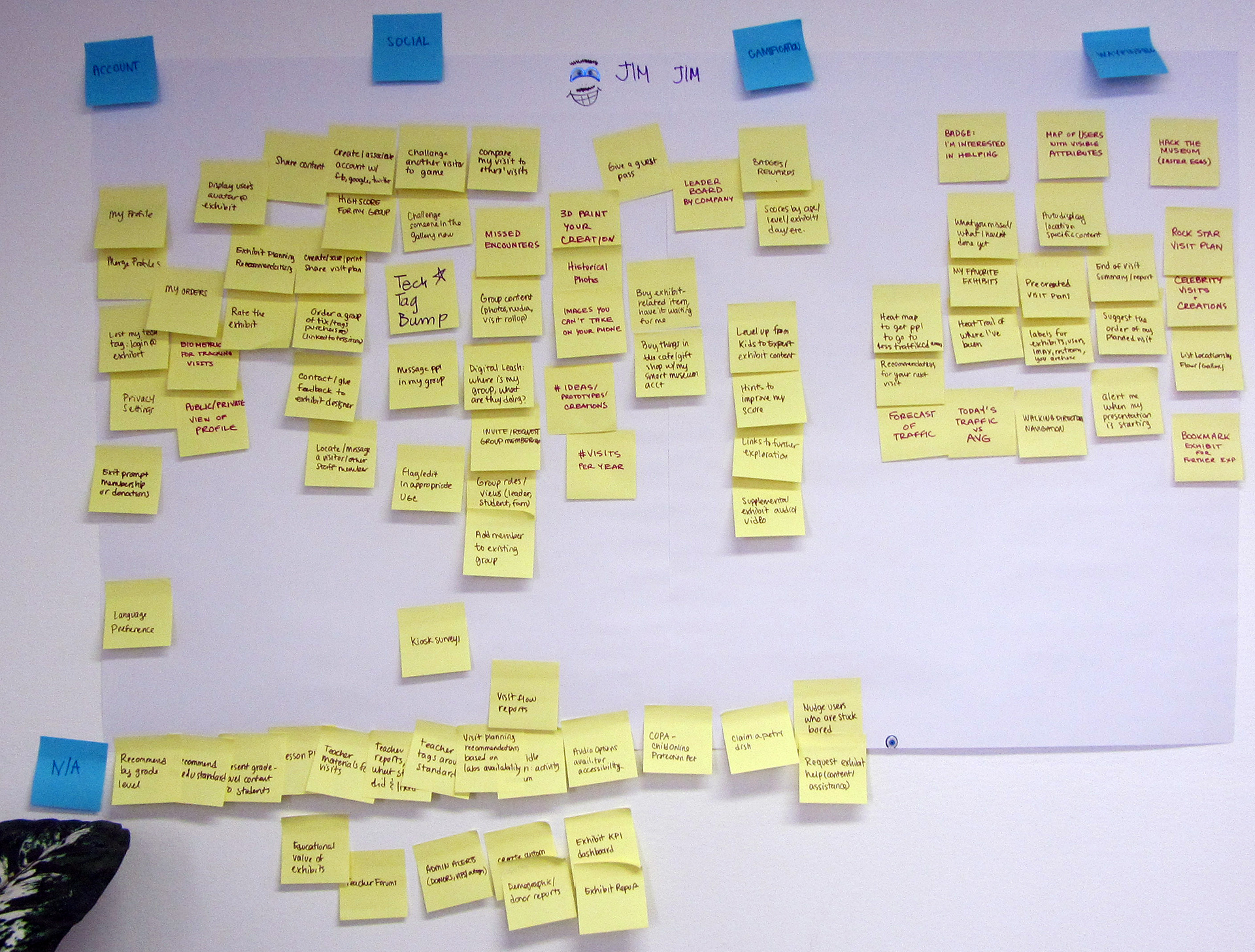
Persona feature assessment
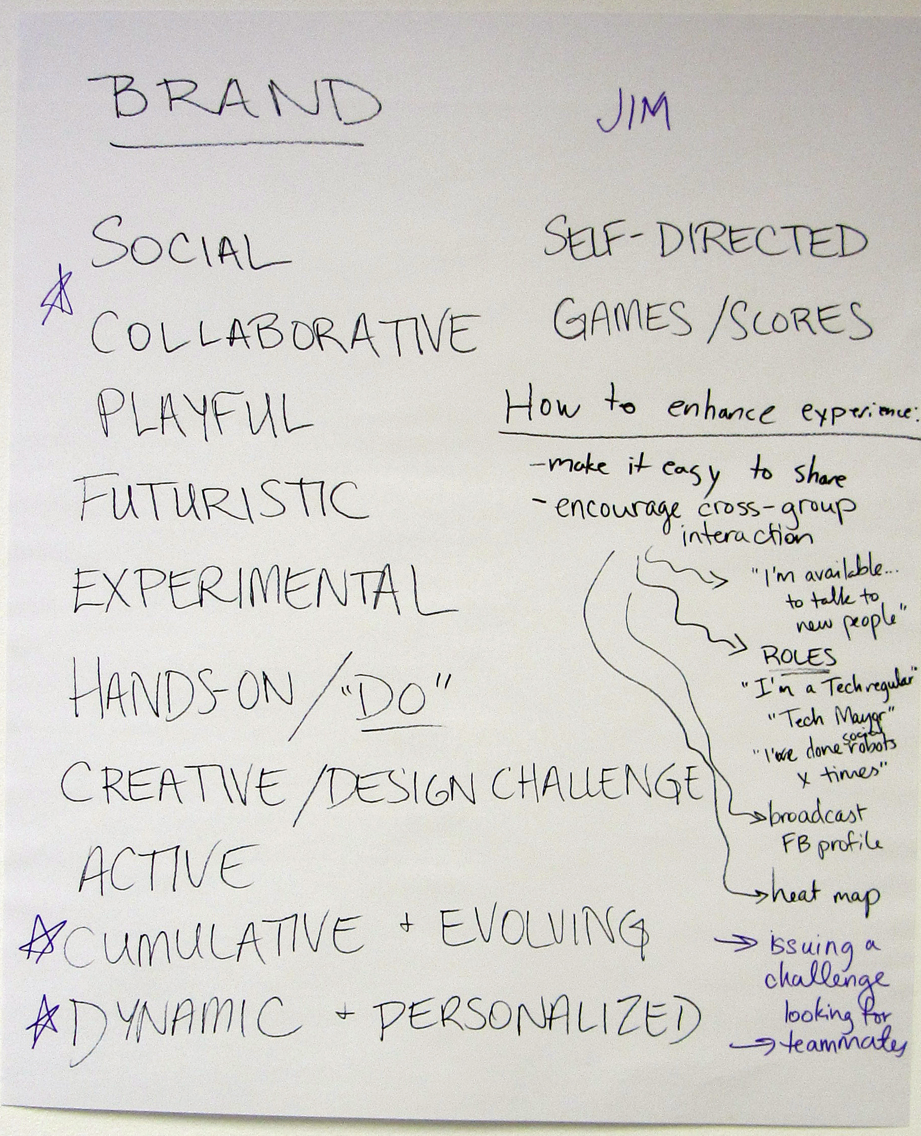
Persona/brand alignment
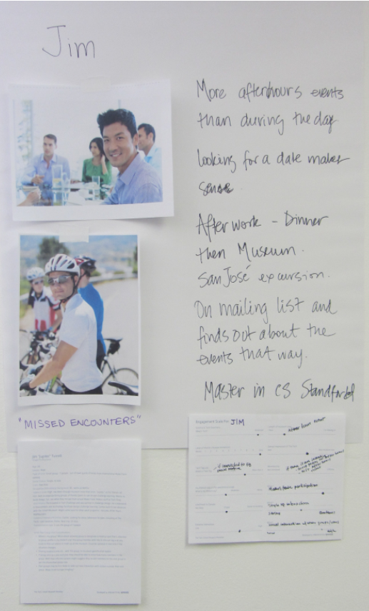
Persona attributes
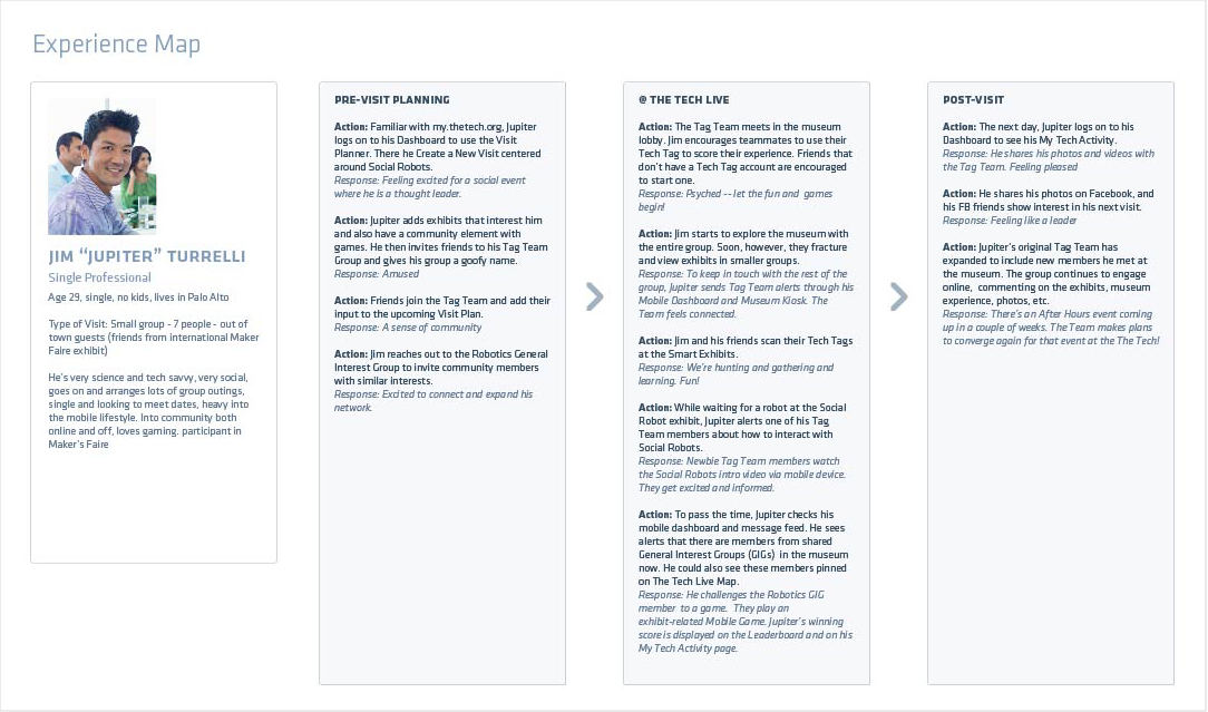
Final experience map
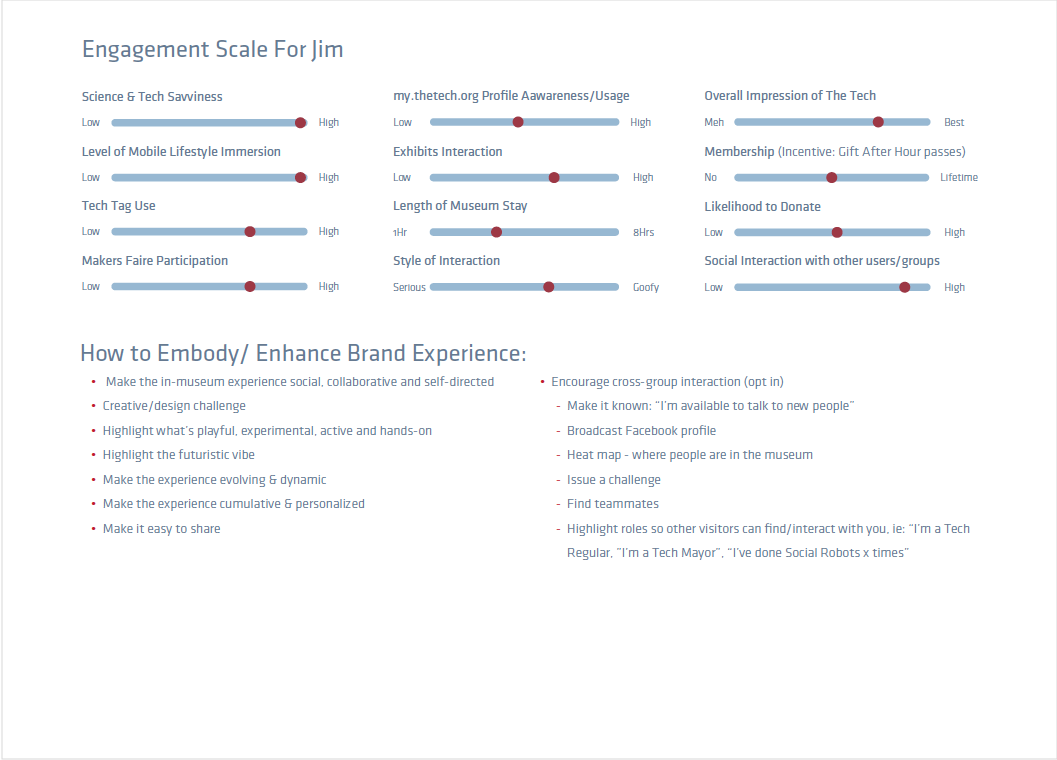
Persona engagement scale
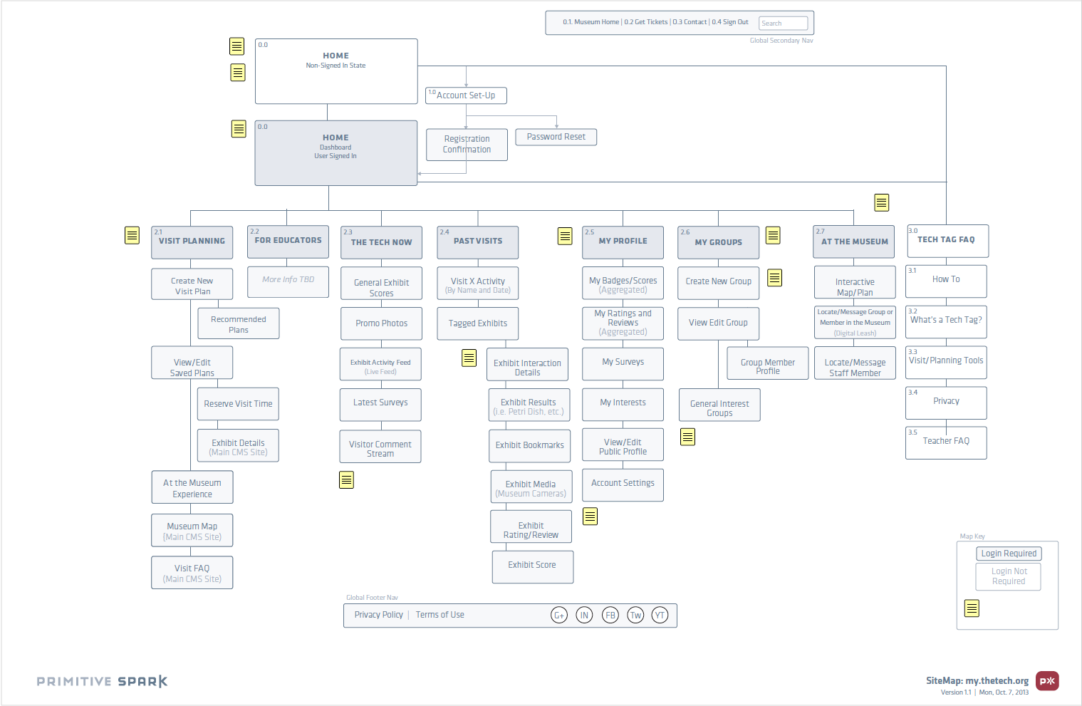
Sitemap

Personalized visitor activity
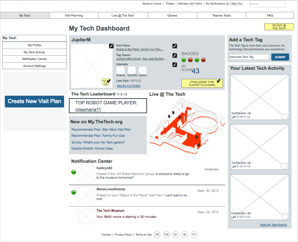
Visitor Dashboard
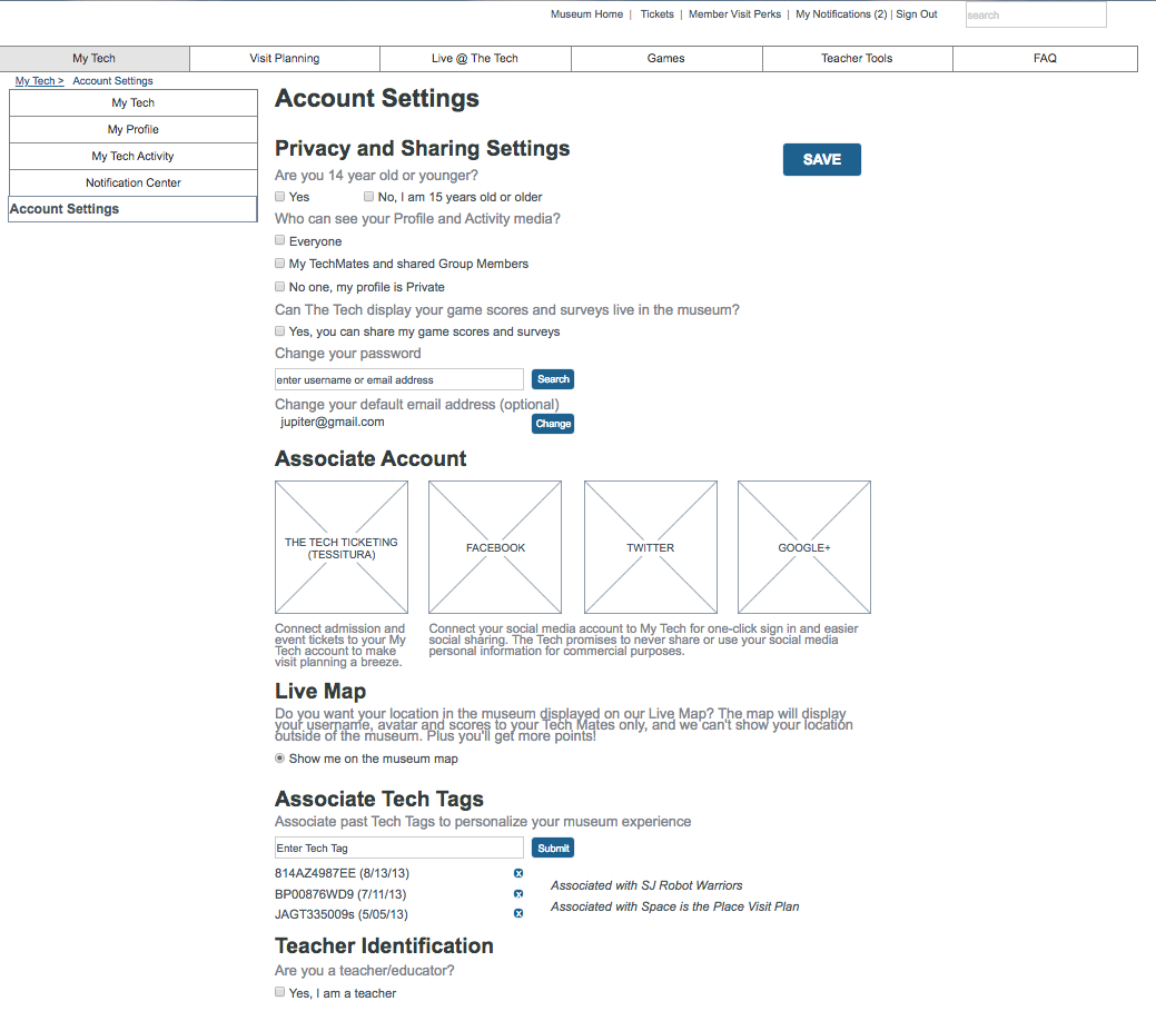
Visitor account settings

