Descanso California Garden - Matilija "fried egg" poppy. Photo by Jill Vacarra.
DESCANSO GARDENS UX
CHALLENGE: Woefully outdated and inflexible website technology platform, design, site structure, and content.
SOLUTION: A new user-friendly website with fully revised information architecture and a fresh look and feel. Content was completely rewritten to extend Descanso's newly established branding to the site's tone and voice. A modernized responsive WordPress CMS implementation that plays well with existing/legacy backend systems.
WHAT I DID: Information architecture + project management + usability testing + content strategy
IN COLLABORATION WITH: KBDA and a team of consultants, including seasoned experts in branding, marketing, strategy, visual design, and technology.
HISTORIC LAND – REINVIGORATED BRAND. Descanso Gardens has a long history of evolving its brand identity to stay relevant to existing fans and donors and connect with new audiences and potential supporters. At project inception, Descanso Gardens was unveiling its master plan, a roadmap for the next 15 years to guide future projects and decision-making for garden facilities, operations, and initiatives. Our mission was to apply this thoughtful brand strategy to a new website structure, UI, and content to amplify excitement for the garden's budding future while honoring Descanso's unique history and character.
1,000,000
APPROXIMATE NUMBER OF DESCANSO VISITORS IN 2024
RESEARCH INSIGHTS. I joined the project after KBDA had completed significant branding, strategy, and visitor research. With KBDA I participated in a rigorous and thorough series of website stakeholder interviews with all key Descanso departments. The research informed our exploration of new approaches to give website visitors an information-rich experience while ensuring garden staff have the technological tools to keep web content fresh and engaging.
PROJECTS WITH PERSONAS HAVE AN ROI OF UP TO 4X MORE THAN PROJECTS WITHOUT THEM
SOURCE: FORRESTER
PERSONAS. Project research data flowed into several activities during the next stages of UX work, including personas created to portray key audiences vividly.
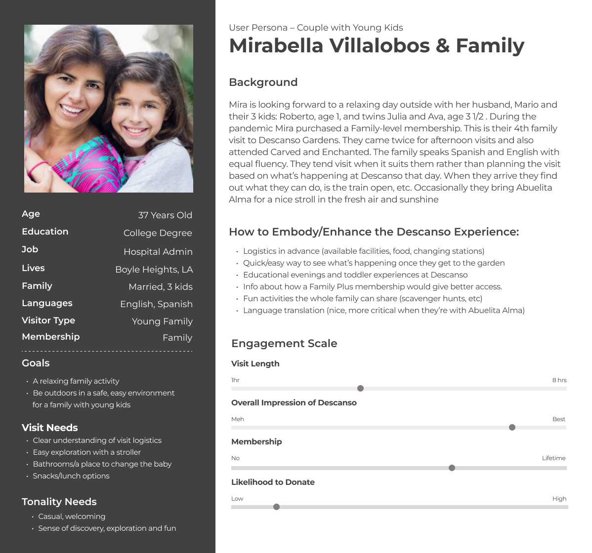
Persona: Family with young kids

Persona: Multigenerational supporters
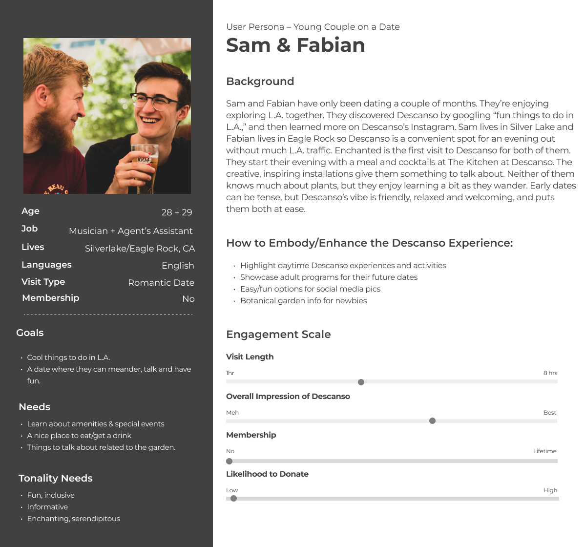
Persona: Couple on a date
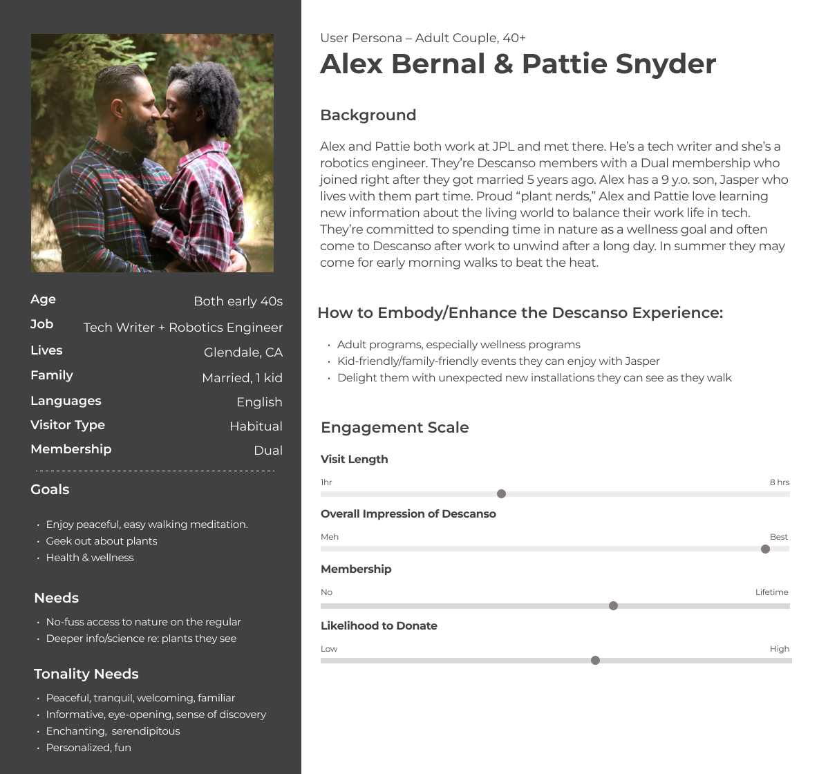
Persona: Adult members couple 40+
SITEMAP & WIREFRAMES. Once the discovery phase was complete we moved into the UX planning and information architecture phase. I created several iterations of a proposed sitemap to give Descanso stakeholders a bird's-eye view of the proposed website structure. No matter how simple or complex the site, I've never had a sitemap approved on round one. The reason: often "too many cooks in the kitchen" along with competing department agendas. The sitemap provided the scaffolding that encouraged robust and thoughtful feedback from Descanso's key constituents. After several Descanso sitemap iterations and approval, I created wireframes in Figma of the homepage and several other key site pages for further discussion and iteration.
Approved Descanso Gardens Sitemap
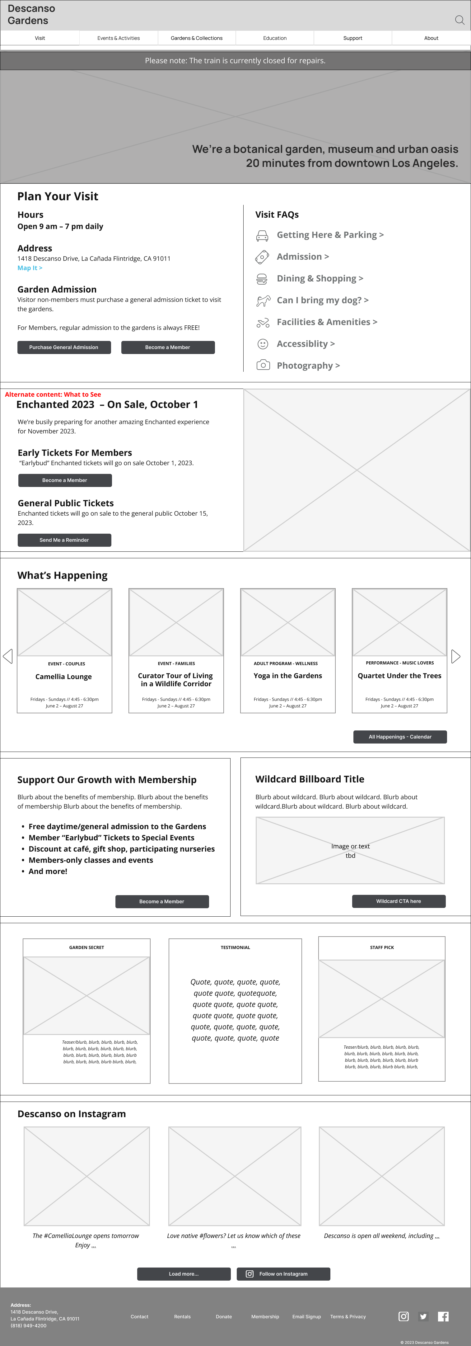
Descanso homepage wireframe
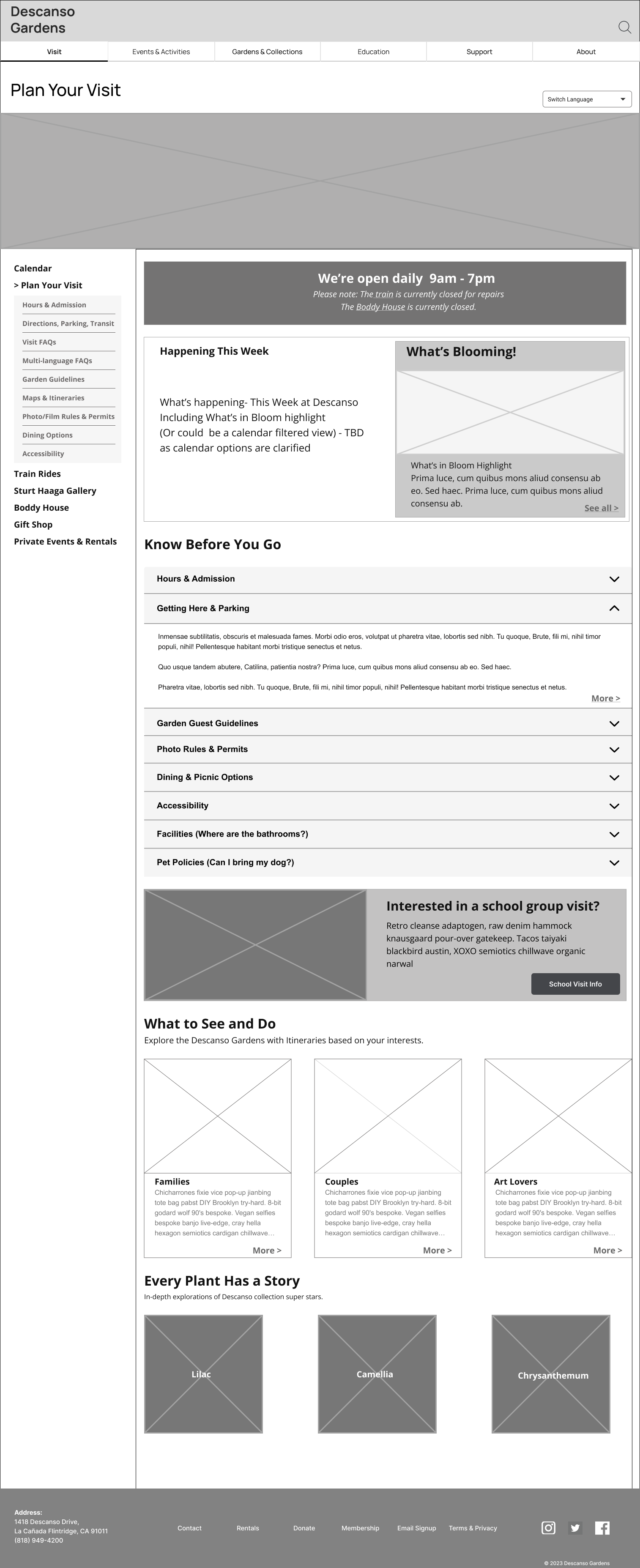
Visit Plan landing
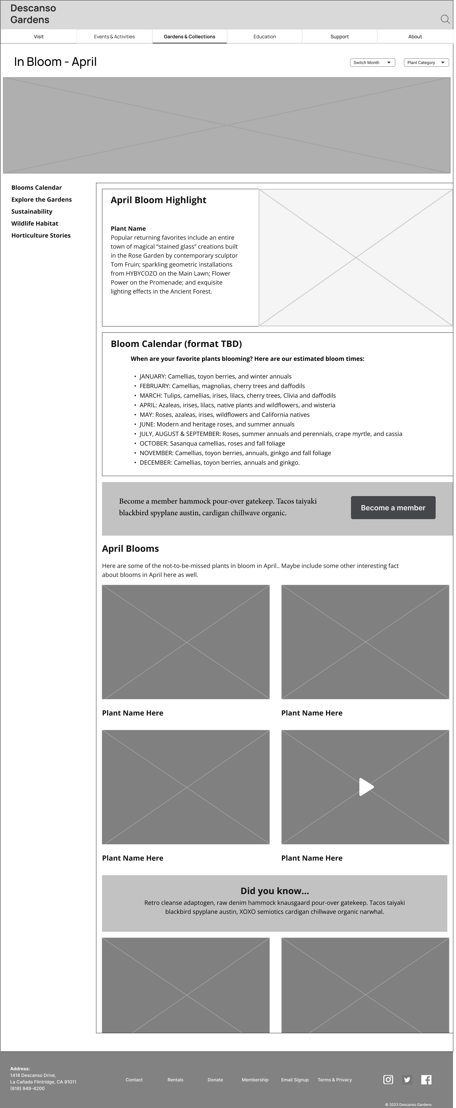
Gardens & Collections wireframe
NAVIGATION MODELS. While constructing the wireframes I proposed a somewhat uncommon navigation design to give users a more seamless and consistent experience across desktop and mobile views. The navigation is similar in both views but leverages a "best of both worlds" approach. The desktop view exposes the primary horizontal navigation list with customary text links in full view. Each primary navigation link, on click, launches a corresponding secondary navigation panel. For the narrow space on a mobile screen, we introduced a hamburger navigation icon to represent the primary navigation. When users tap the hamburger icon the sliding side panel presents the full navigation list displayed in a vertical view. Both navigation panel versions allow Descanso to display key visitor info and garden updates.
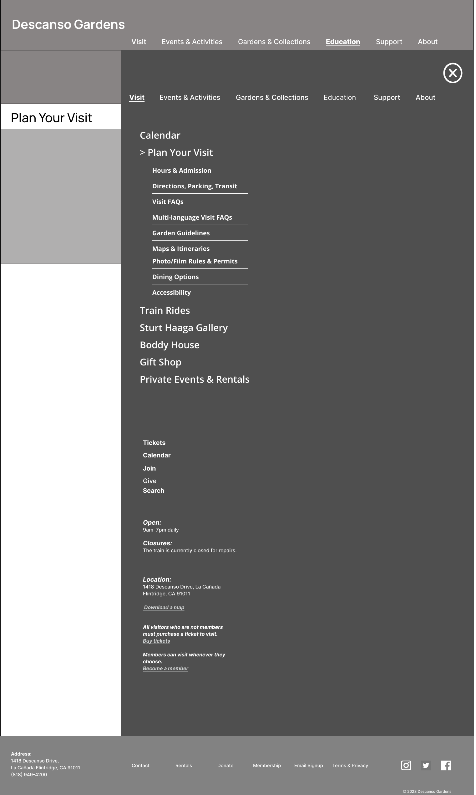
Desktop nav slider wireframe
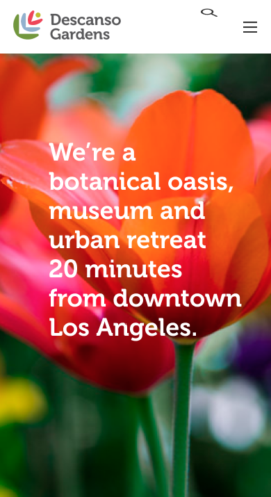
Mobile home screen w/ hamburger icon
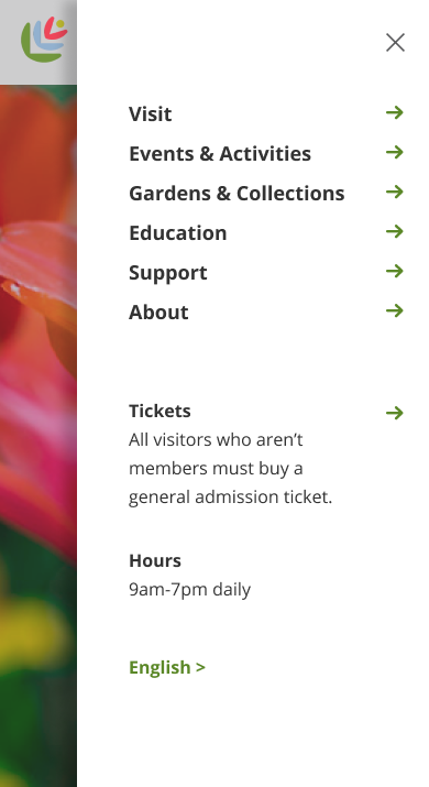
Mobile nav slider design comp
TEST ANYTHING UNUSUAL. The proposed nav model for the new Descanso website wasn't unheard of. A survey of other museum sites showed at least one museum using the same setup. That said, even UI patterns that seem commonplace can befuddle users in surprising ways. Most UX designers assume all users know what the hamburger nav icon (3 horizontal lines) connotes. However, I've tested the icon on many prototypes and often find users are not sure what the icon means. I recruited and facilitated
5 usability tests for the Descanso wireframes via Zoom to make sure the desktop and mobile slider panel navigation concept was intuitive for actual website users. We tested the UI with a mix of typical Descanso visitors of various backgrounds and ethnicities in their 20s, 30s, 60s, and 70s.
FIGMA PROTOTYPE. Users interacted with a Figma prototype that featured the proposed new navigation nomenclature and representative content with limited clickability throughout but realistic interaction animation for the slider panel mechanism. Participants intuitively understood the nav panel and were not put off or confused by the secondary list of nav items or the info at the bottom of the panel. Users found the primary navigation nomenclature to be generally intuitive, but there were a few names that we updated to address potential confusion. A few users explicitly wanted more imagery on the navigation panels. This feedback led us to incorporate larger images on each of the navigation slider panels.
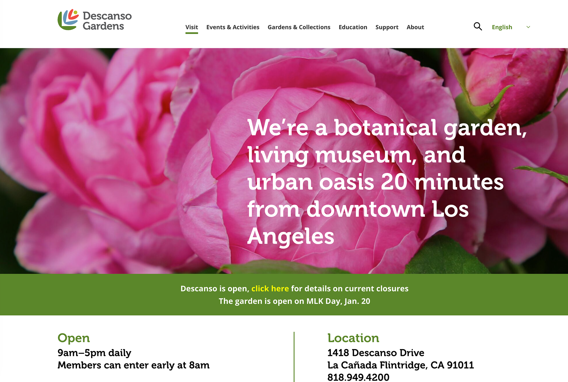
Descanso desktop homepage with horizontal primary nav
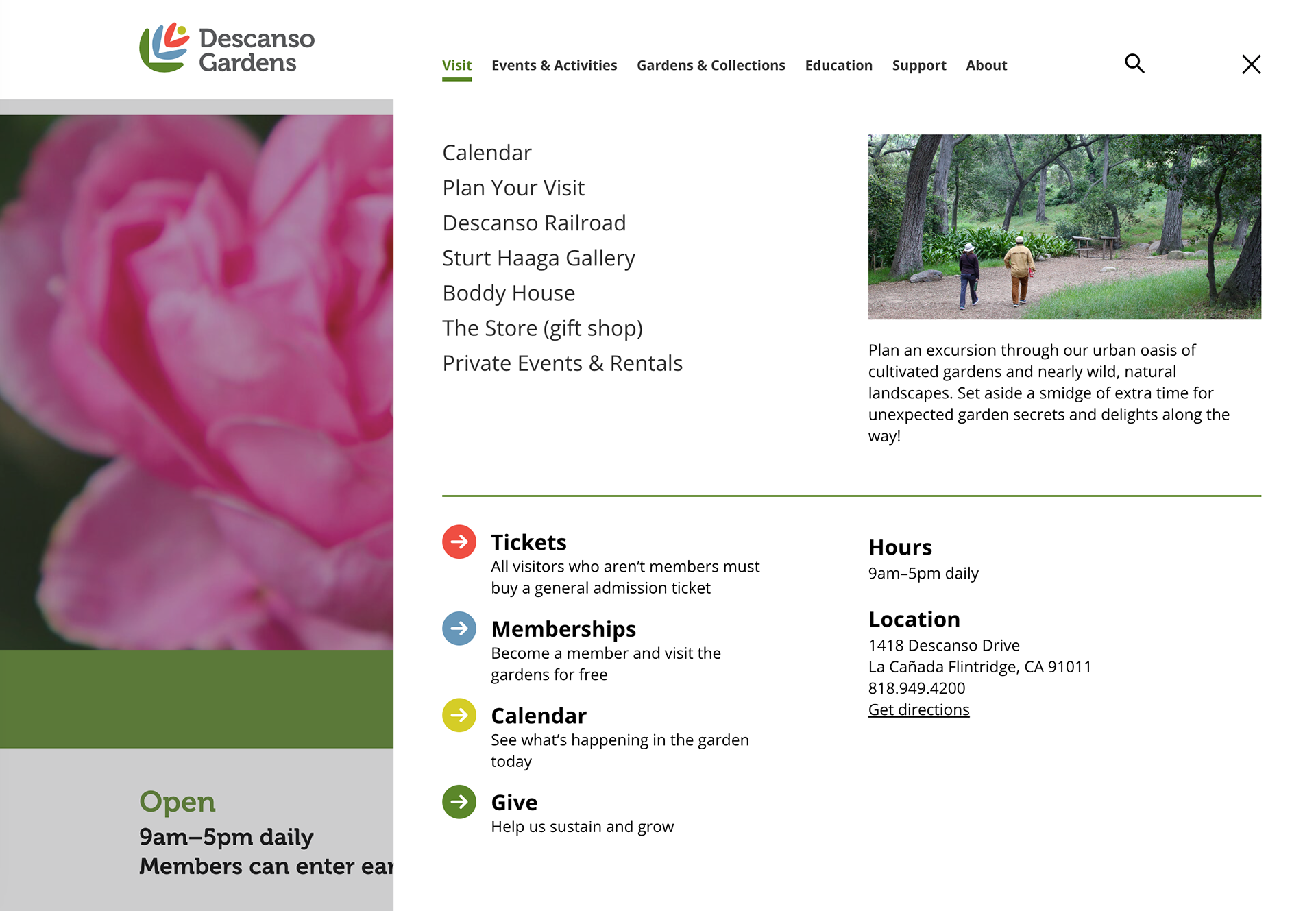
Descanso desktop homepage with nav slider expanded
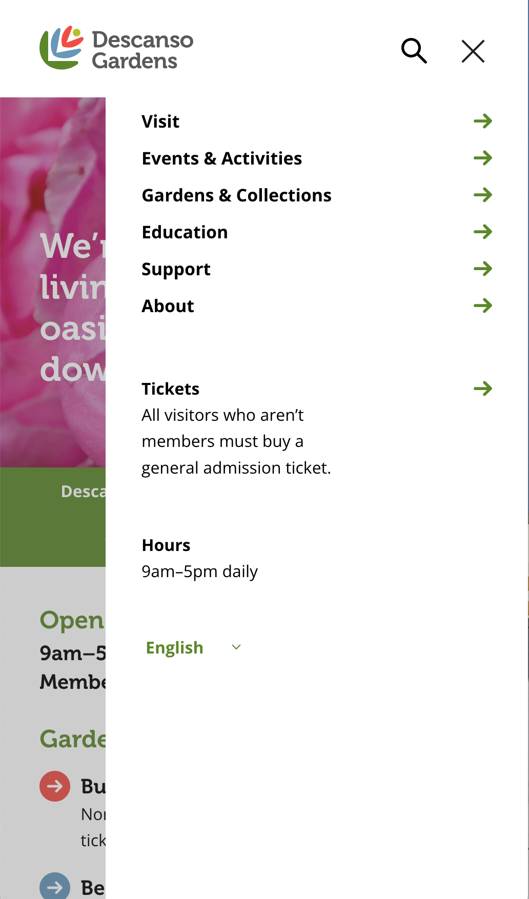
Descanso mobile homepage with mobile nav slider expanded
CONTENT STRATEGY. Once the key parts of the information architecture were completed I started work on Descanso's content project. Get all the details in the Descanso Gardens Content case study.
PROJECT MANAGEMENT. Because I worked on so many aspects of the project I shepherded the project through most of its key phases. I provided timelines and maintained schedules. I set up project processes and efficient handoff materials and acted as a liaison between the various team disciplines and client constituents.


