UX RESEARCH PROJECTS
CHALLENGES: With the normalization of the UX practice in digital product design people still sometimes forget that the acronym stands for User Experience and that without users it's not UX design. User research and testing are a critical ongoing part of the UX process to ensure designs are successful for users and businesses/organizations.
SOLUTION: I build UX research into my work process throughout the entire length of any project via several tried and true methods.
METHODS INCLUDE: Contextual interviews, usability testing, concept testing, participatory design, card sorting, in situ field testing, intercept testing, follow-alongs, and ethnographic research.
" UX RESEARCH IS LIKE HAVING GUARDRAILS
ALONG THE INTERSTATE. THE GUARDRAILS
AREN'T THE ACTUAL ROAD, BUT THEY MAKE
SURE YOU DON'T DRIVE OFF A CLIFF. "
- KATHRYN CAMPBELL, GLOBAL RESEARCH & INSIGHTS LEADER
WHICH RESEARCH METHOD IS THE RIGHT ONE? The choice of UX research method depends on what you want to learn and where you are in the product timeline.
I employ various UX research methods to validate assumptions — to guess less and challenge biases (including my own) so that I can find evidence-based opportunities to deliver valuable solutions and experiences for end users and clients.
PROJECT SNAPSHOTS. Below is a quick look at a few projects where my colleagues and I gained important insights by leveraging different user research methods.
"SUPPOSING IS GOOD, BUT
FINDING OUT IS BETTER"
- MARK TWAIN
PAINT COMPANY IN SITU & FOLLOW-ALONG RESEARCH. There are critical pieces of info you can easily miss by not meeting users where they are, in their own environments. A well-known paint company was exploring new online tools for its retail customers. For one in situ interview we spent time in the family home of a DIY painter dad with young children who explained how he needed to have his interior wall painting project done and dry in a single weekend due to the challenges
The same paint company was considering online tools and content for interior designers and other pros responsible for specifying paint products for commercial building and interior design projects. We spent a day following an interior designer who was in the process of collecting materials for a build-out of one of the first co-working spaces in Los Angeles. We uncovered opportunities for digital tools to assist the interior design process when we saw how many materials she was collecting and schlepping to and from the job site.
of having young children running around the house. He told us he could use some expert technical info and tips from the company while he worked on the weekend (for instance paint prep techniques and drying times). These were user problems the company hadn't been considering before the in situ research.
RESTAURANT PROS - RESEARCH RECRUITING. Getting accurate data is entirely dependent on finding the right users for your research. Recruiting for research is more complex for projects that require niche user types with very specific attributes. Our client wanted to understand how restaurant pros use features in point-of-sale systems like Toast and Square and wanted to talk to 40-50 restaurant owners/managers. Finding study participants was the most challenging part of the project. We used two online recruiting agencies. We posted on social media and sent direct messages to our business networks, friends, and family. We also directly emailed restaurants across the U.S. to find participants from a wide range of locations. After several weeks of painstaking searching, we were able to recruit 40 appropriate users from whom we could collect useful data about POS feature usage.
We recruited 40 user participants from across the U.S.
DID YOU KNOW?
CARD SORTING IS ONE OF THE OLDEST, SIMPLEST, CHEAPEST, FASTEST, AND MOST USER-FOCUSED RESEARCH METHODS.
CARD SORTING & PARTICIPATORY DESIGN. Card sorting research helps uncover a user’s mental model in terms of the categorization, relationship, and hierarchy of a set of items. Content and features are written on physical or digital cards. Then users sort and organize the card stack into the categories that make the most sense to them.
I typically test terminology, content verbiage, label nomenclature, information groupings, categorization, information hierarchy, and relationships. Card sorting can
be used at any time in the process, but is especially useful when first establishing terminology and groupings. If you skip card sorting early in the process, a
sorting exercise with relevant users can help you illuminate persistent confusion.
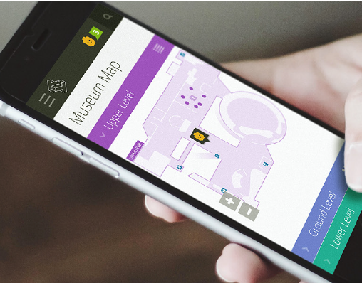
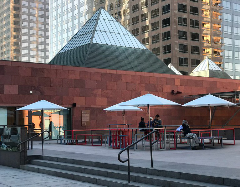
In the case of NHM (Natural History Museum of Los Angeles), a card sorting exercise set up online in the Trello tool revealed that users were confused by separate categories for exhibits and collections, which seemed synonymous to them. Among other insights, the card sort led to additional exploration of alternative ways to categorize this key museum content.
As part of a Toyota usability test, we had users give feedback to gage their feelings about the interface they had just explored by interacting with set of product reaction cards.
85%
ON AVERAGE, WE CAN IDENTIFY 85% OF
USABILITY ISSUES WITH JUST 5 TEST PARTICIPANTS.
DESCANSO GARDENS NAVIGATION MODEL - USABILITY TEST. We tested a slightly unusual navigation model proposed for the new Descanso Gardens responsive website. The proposed design would house the navigation in a sliding side panel on both the desktop and mobile views. The navigation is similar in both screen types but uses a "best of both worlds" approach. The desktop view exposes the primary horizontal navigation list with customary text links exposed on the UI. Each primary navigation link, on click, activates a navigation panel slider. For the narrow space on a mobile screen, we introduced a hamburger navigation icon to represent the primary navigation. When users tap the hamburger icon the sliding side panel presents the navigation links displayed in a vertical view.
Participants understood the nav panel slider on desktop and mobile and liked the info at the bottom of the panel. Several users specifically asked us to add imagery to the navigation slider panel, which we did. The nav slider iteration with imagery can be seen in the images below.
Initial navigation panel tested with users

Desktop view with standard horizontal nav links

Desktop view w/ on nav link clicked to reveal slider menu
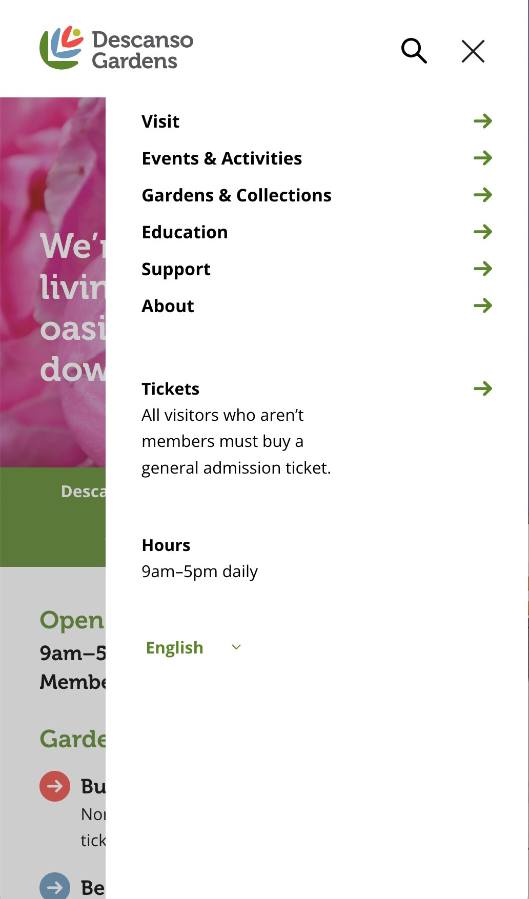
Mobil nav panel after clicking hamburger nav icon
MOBILE USABILITY TESTING. For a fast food mobile app and a Toyota app we showed users prototypes that participants could access via their personal phones. We wanted a way to unobtrusively have a small camera floating above the phone screen during the test. We couldn't locate/purchase a product that would satisfy this need, so one of our design team members fashioned a special phone cradle out of lucite to which we could attach a camera that hovered above the device screen. This way during the testing we could record the phone screen with one clip-on camera and simultaneously capture video of the user's face and reactions via a small camera on a table tripod.
On the fast food app, we learned, among other things, that users didn't understand the difference between the two major sections presented in the prototype for Deals and Rewards.
With the Toyota testing our study participants told us they prefer to do longer/deeper research sessions on car models on a laptop or desktop because the larger screen allows them to grasp the depth of information about each car. Several users reported using their mobile devices to research new car specs when they don’t have access to larger devices.
SURVEY SAYS. I've conducted many surveys, both quantitative and qualitative. Surveys are a great way to collect large amounts of data with relatively low effort and cost. I've led quantitative surveys to understand user preferences, perceptions, feelings, attitudes, and opinions. I have collected useful qualitative info as well when I've designed a survey for a small number of people with questions that prompted them to provide expository responses to open-ended questions. Generally, I've found surveys to be most useful early in the product design lifecycle or after product launch.
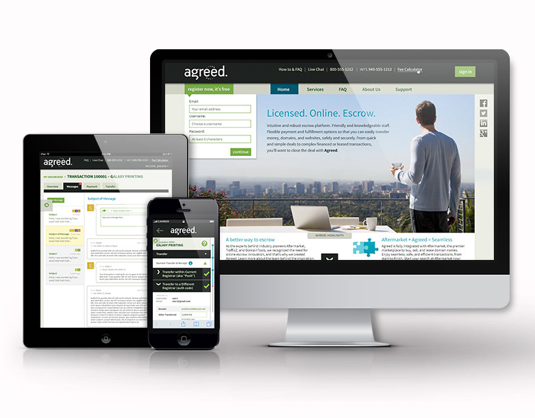
I've conducted surveys to gather intel on product naming options, logo options, product usage, and Net Promoter for clients such as Monrovia, CU Direct, Toast POS, BCG, Agreed, The Laundress, and Molina Healthcare.
A/B TESTING. Also known as split testing, A/B testing involves a series of controlled research experiments conducted over time to identify small, incremental opportunities to improve designs based on quantitative data rather than opinions or guesswork. In UX design, A/B testing is often best conducted after a round of usability testing when you've identified specific areas of user friction with the UI. Once you know where the problems are and have come up with possible design solutions, you can test two or more new UI ideas to see which eliminates or reduces the friction with the greatest success. I've conducted split tests for clients such as CU Direct, UCLA Anderson School of Business, Burger King, Agreed, and The Tech Museum of Innovation.
