MOCA EDUCATION
PROBLEM: Transform costly, exclusive print curriculum materials into a robust and extensible online arts education program
SOLUTION: A flexible online curriculum system to make contemporary arts education readily available
WHAT I DID: Information architecture + user research + content strategy
IN COLLABORATION WITH: Primitive Spark + Hammer Labs
KIDS THRIVE ON ARTS EDUCATION. With LAUSD budget cuts, even the most basic arts education programs have gotten the ax in L.A. public schools. Luckily, online tools have become a more viable resource for educators. MOCA's award-winning Contemporary Art Start (CAS) curriculum is the centerpiece of an extremely sophisticated and comprehensive museum-sponsored education initiative. CAS was designed to give grade-school educators the training and tools to holistically integrate contemporary art theory and practice lessons into the classroom.
CAS ONLINE EXTENDS ARTS ED REACH. To deliver this extensive curriculum, MOCA had designed an enormous printed binder heavy with gorgeous glossy printed materials. But small, spendy print runs made the content exclusive and unavailable for widespread use. MOCA tasked my team and me with making the CAS curriculum more widely available to educators by converting it into a rich online experience that MOCA staff could continually and easily refine and update.
MOCA'S WEBSITE WAS A CRAZY QUILT. The MOCA website at the time hadn't had a full IA and design overhaul in years but had had some spotty cosmetic work done to several sections. The resulting overall site was a mishmash of several wildly different design templates, all in simultaneous use. We were instructed to focus on the Education section of the site only, and not to venture into the quagmire that was the MOCA site at the time.
HOW TO BRING IT ALL ONLINE? FIRST FIND FLOOR SPACE.
To transform an unwieldy curriculum binder into a fluid online experience you need patience and a whole lotta floor space. Luckily our spacious design studio could provide. I spread out all the printed CAS materials along our studio floor and spent several days surrounded by CAS, immersing myself in dozens and dozens of lessons, curriculum inserts, and pamphlets until I came up with a concept for a web-based structure that could accommodate all existing materials and leave room for digital evolution and innovation.
BACK TO SCHOOL. During the process, I visited several L.A. area public school classrooms to observe how they were using the printed CAS materials. I conducted a series of eye-opening in situ interviews with public school teachers to clarify their particular needs and issues – including some unexpected internet access constraints that led us to propose digital offline components that would enable the CAS experience in the absence of internet access.
USABILITY TESTING TO ID KNOWLEDGE GAPS.
I developed wireframes and a clickable Axure prototype and then led several usability testing rounds with user segments recruited from LAUSD to refine the information architecture of the CAS curriculum online. The new digital CAS UX launched several useful features to encourage teacher engagement: User reviews, teacher profiles, and educator community forums.
WHO DOESN'T WANT A COHESIVE VISUAL SYSTEM?
We developed a clean, sophisticated look and feel for CAS that the museum also applied to the entire Education section of MOCA's website. This new look and feel was also applied to a new site-wide MOCA Calendar, and to several additional key top-level site pages to help visually integrate the MOCA site overall.
"THIS IS LIKE LIFE COACHING, BUT FOR MY JOB!"
- JEANNE HOEL, MOCA, ASSOCIATE DIRECTOR OF EDUCATION
(RE: CAS CMS TRAINING SESSION)
MIX CMS TRAINING + LIFE COACHING. After the visual design was complete, our partner development team created a customized Drupal CMS for CAS online. I was on board for content strategy during the CMS development process. I also created CMS training materials and presented training sessions to the Education staff that not only streamlined and centralized their website maintenance process, but also helped the MOCA Education team holistically rethink offline job tasks and processes.
CAS GOT AN "A+" GRADE. Teacher feedback on the new
web-based materials was glowingly positive. MOCA's online CAS education experience ensures grade school teachers have access to
all the tools they need to teach contemporary art in the classroom.
PROCESS DOCS
INFORMATION ARCHITECTURE
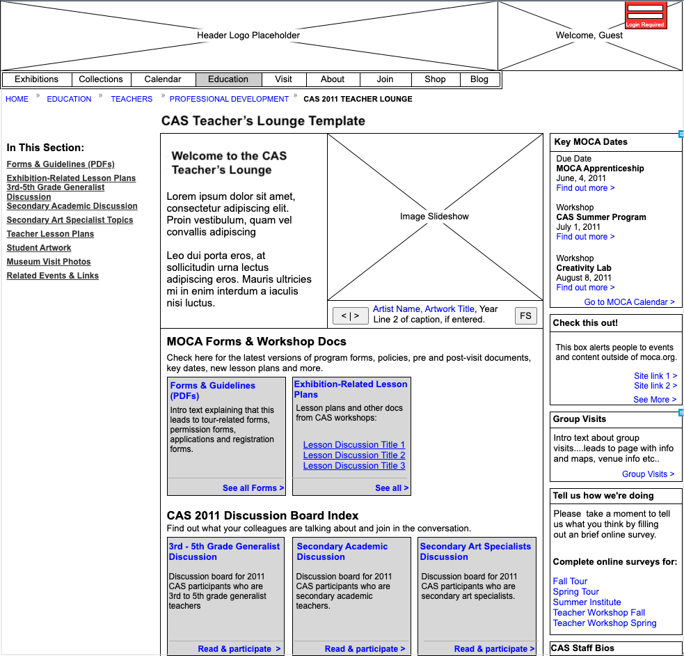
CAS Teacher's Lounge

CAS - Looking at art
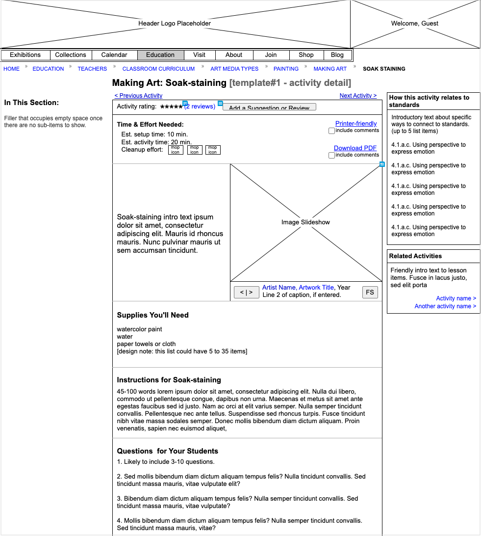
CAS - Art making detail
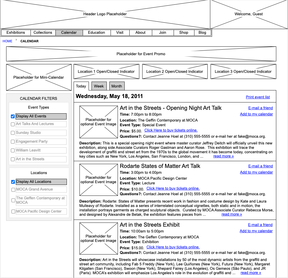
MOCA Calendar
USABILITY TESTING
MOCA usability testing - sample findings screen
VISUAL DESIGN
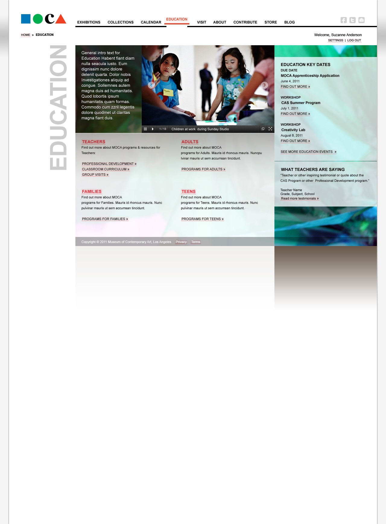
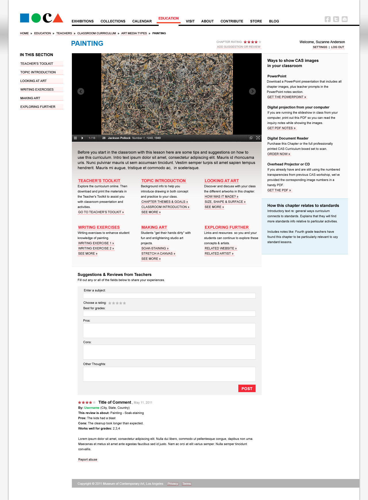
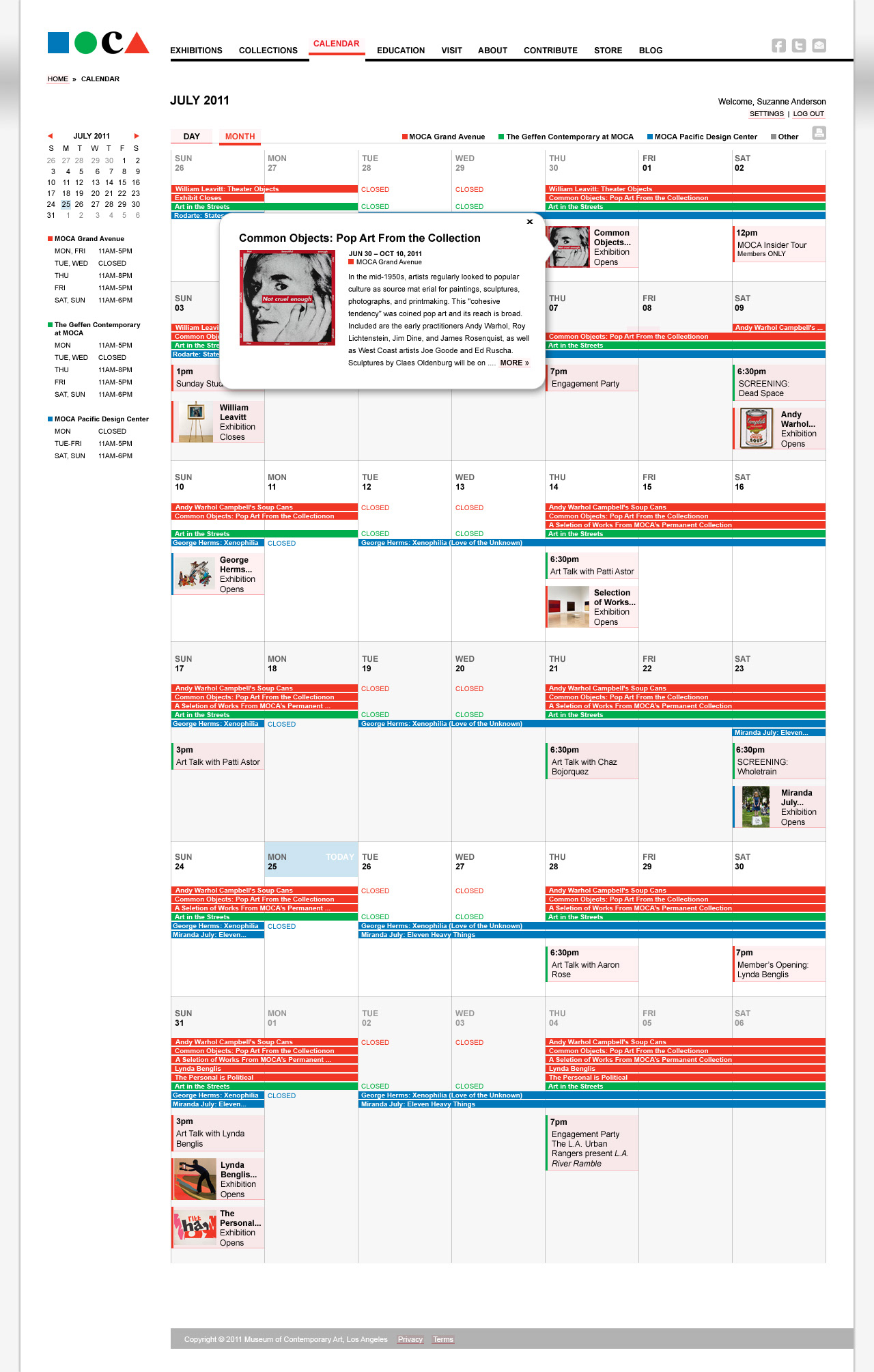
Designs by Wendy Nyx, Primitive Spark


